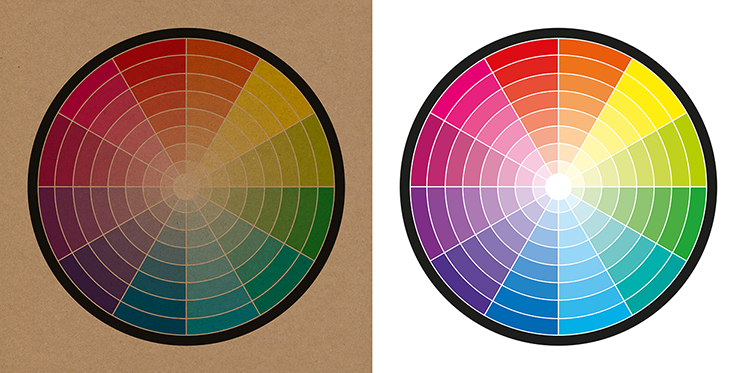
When designing for Kraft paper, it is important to avoid yellow and very pale or light colours as they do not provide enough contrast against the brown Kraft paper. It's also worth noting that we are currently unable to print white ink on Kraft paper products, so any white elements of your design will take on the colour of the Kraft stock.
The colour wheel below should give you an idea of which colours and tones will work best. As a general rule, opt for darker, more saturated colours such as black, brown, and deep red, as well as muted shades such as pastel pink or light blue. Avoid using colours that are too similar to the brown colour of the paper, as this can make your design difficult to read.